Friday, 7 February 2014
Update
During this lesson we went through our schedule and decided that tomorrow, we would go out and take photos for our principal shoot. Today we all updated our blogs and started to collect and create photos for the profiles of our three protagonists.


Wednesday, 5 February 2014
Font notes
In Leanne's lesson we began talking about font types and a class analysis of a few title sequences.
Catch Me If You Can
-Smooth
-Flowy
-Sense of constant movement (characters are constantly moving/running away)
-2 fonts represent two different characters
San serif font - outlaw, the font is changing and moving
serif font - official, government, western? FBI Agent
-clear fonts, easy to read
-Saul Bass esque (lines and colour)
Lord of War
-White font - dark background
-Small, centered
-Bullet - dehumanises - not attached to characters
-San serif font
-Soviet writing - Russian, cold war, warish
-military cap letters (serious, no humour, unemotional)
-printed in metal
-Actors names - centered, lesser actors and crew to side
-roles - simplier - rounded, constrast
Forrest Gump
-Serif font
-plain, long (stretched)
-white - purity
-older- more traditional font/film
-newsprint
-slow paced, soft and steady, gentle
-fades in, soft and gentle
-large font, centered
Catch Me If You Can
-Smooth
-Flowy
-Sense of constant movement (characters are constantly moving/running away)
-2 fonts represent two different characters
San serif font - outlaw, the font is changing and moving
serif font - official, government, western? FBI Agent
-clear fonts, easy to read
-Saul Bass esque (lines and colour)
Lord of War
-White font - dark background
-Small, centered
-Bullet - dehumanises - not attached to characters
-San serif font
-Soviet writing - Russian, cold war, warish
-military cap letters (serious, no humour, unemotional)
-printed in metal
-Actors names - centered, lesser actors and crew to side
-roles - simplier - rounded, constrast
Forrest Gump
-Serif font
-plain, long (stretched)
-white - purity
-older- more traditional font/film
-newsprint
-slow paced, soft and steady, gentle
-fades in, soft and gentle
-large font, centered
Tuesday, 4 February 2014
Fonts
Fonts
From our questionnaire, we had decided that this font was our favourite, however we had decided to play around with the font top make it more interesting.
This is our font plain. As a group we think that this is a little plain and boring.

I thought it would look great if there was a shadow, however as a group we decided that the light grey/white shadow makes the font look too comedic.

Using the same shadow idea, we changed it so that there was a darker red shadow. Aiden likes this version of the font.

As another design with the shadow idea, we changed the shadow to a dark grey. Louis likes this version.

I am unsure as to which version I like. I think we should wait until Terry sees this (as he is absent today) and see which he prefers out of our final two.
UPDATE: Terry came back in and decided that the one with a dark grey shadow over the red.
Friday, 31 January 2014
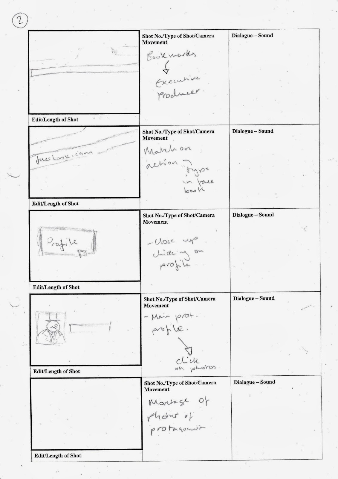
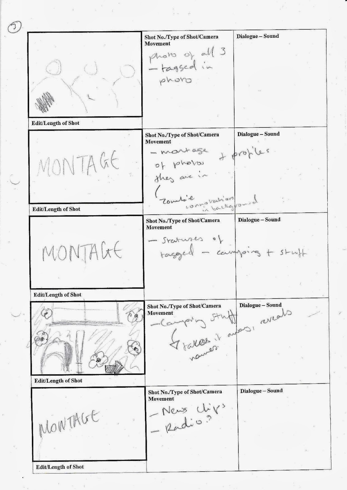
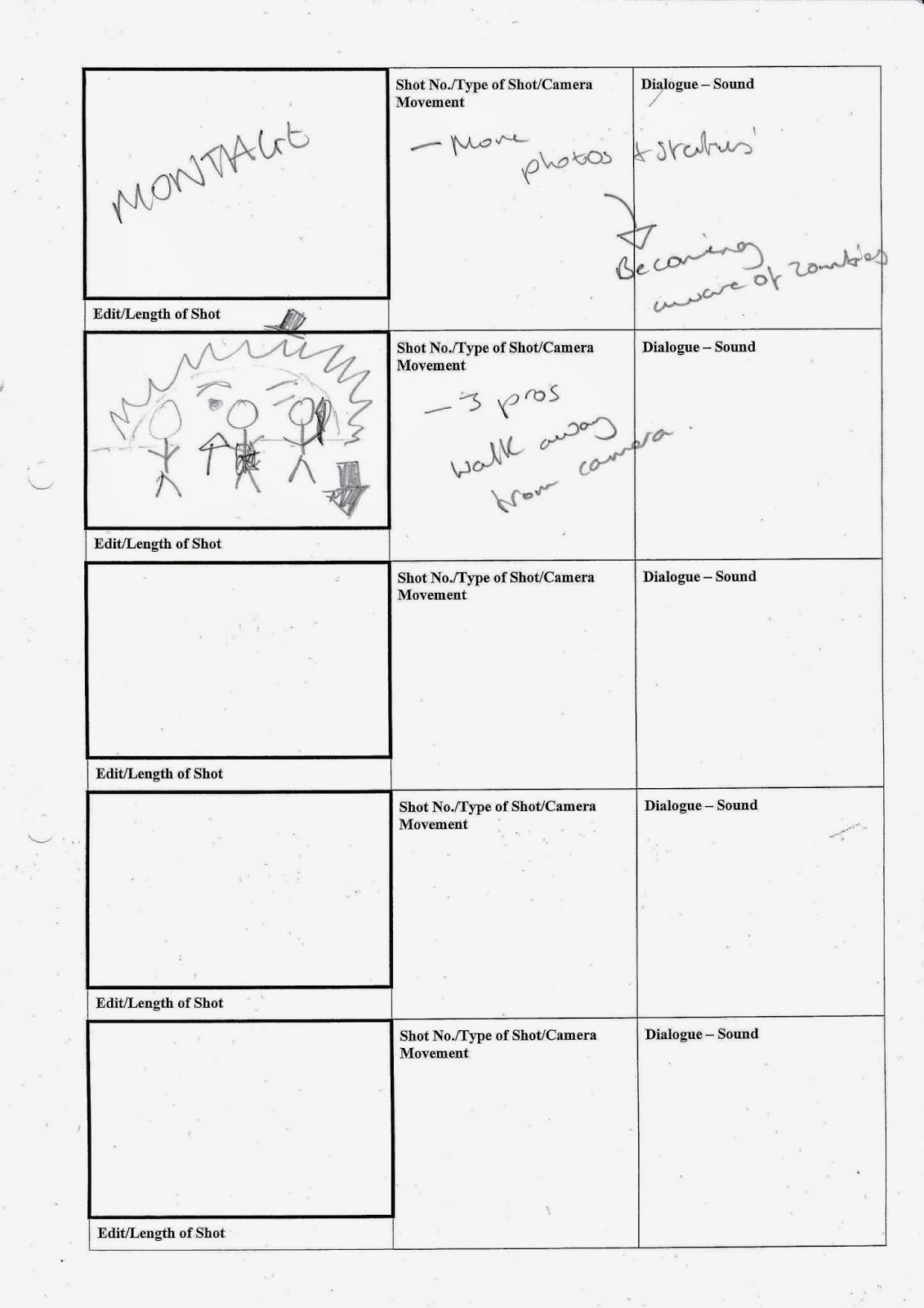
Initial Storyboards
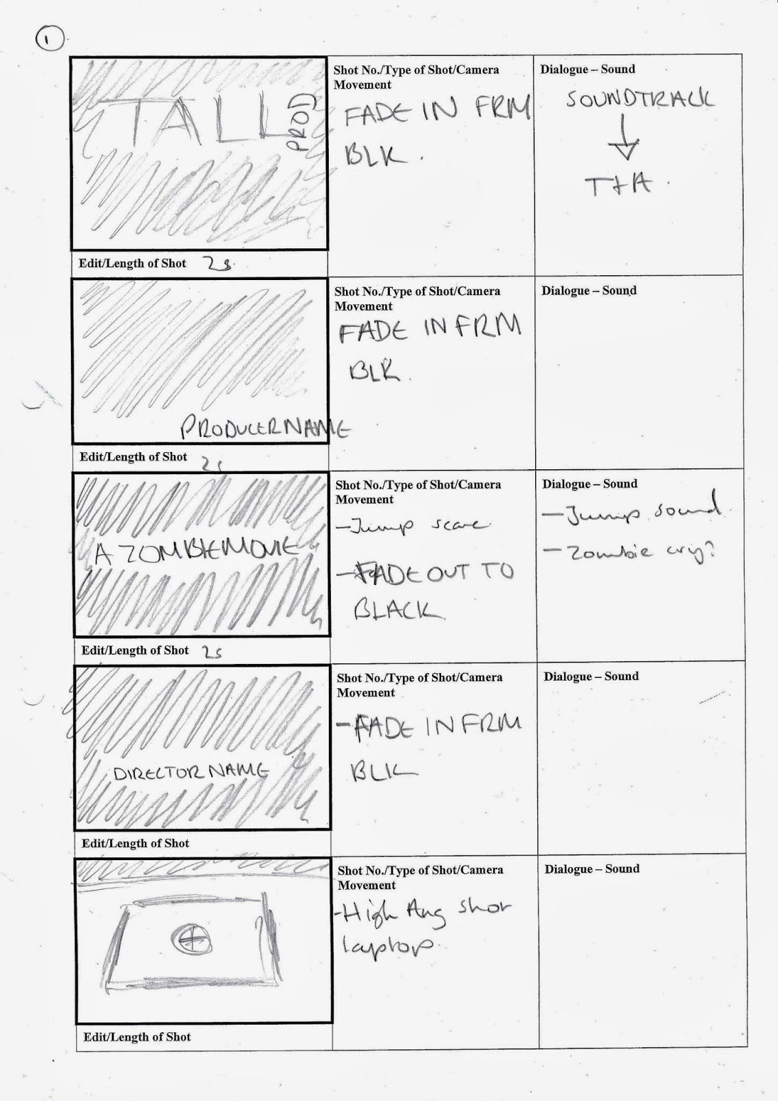
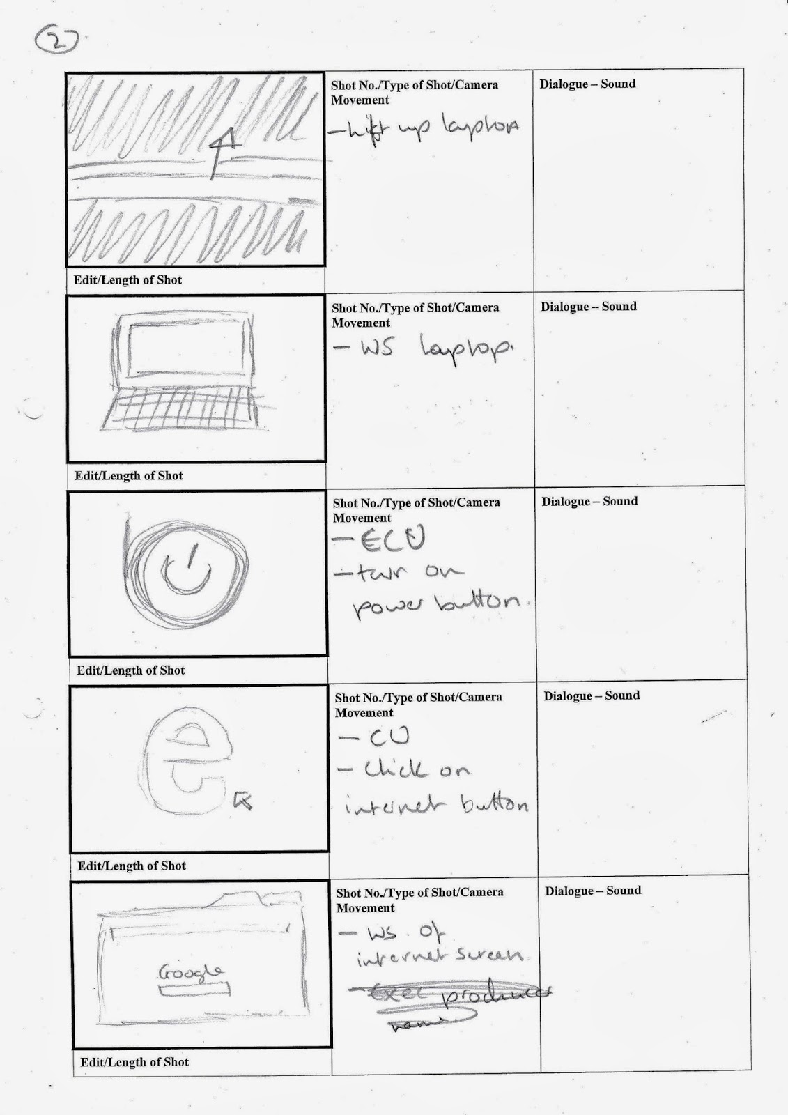
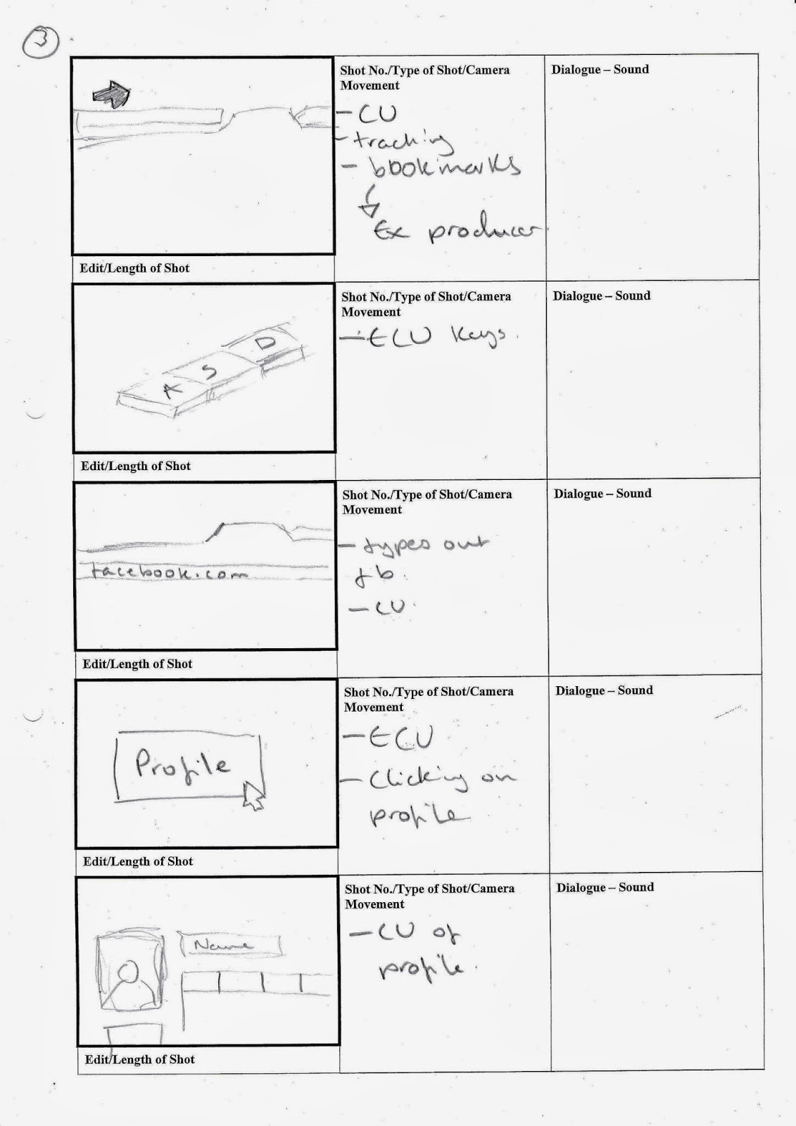
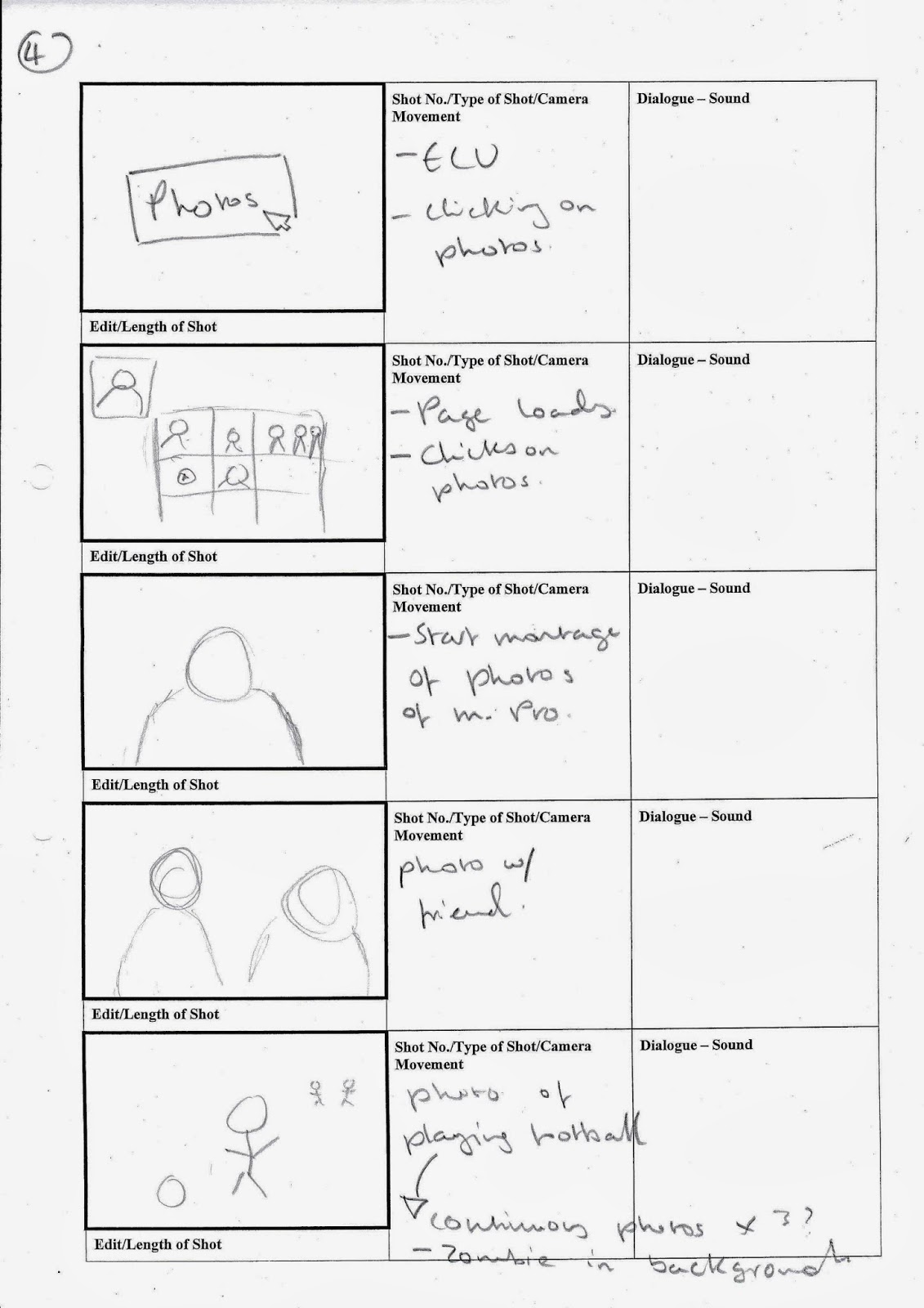
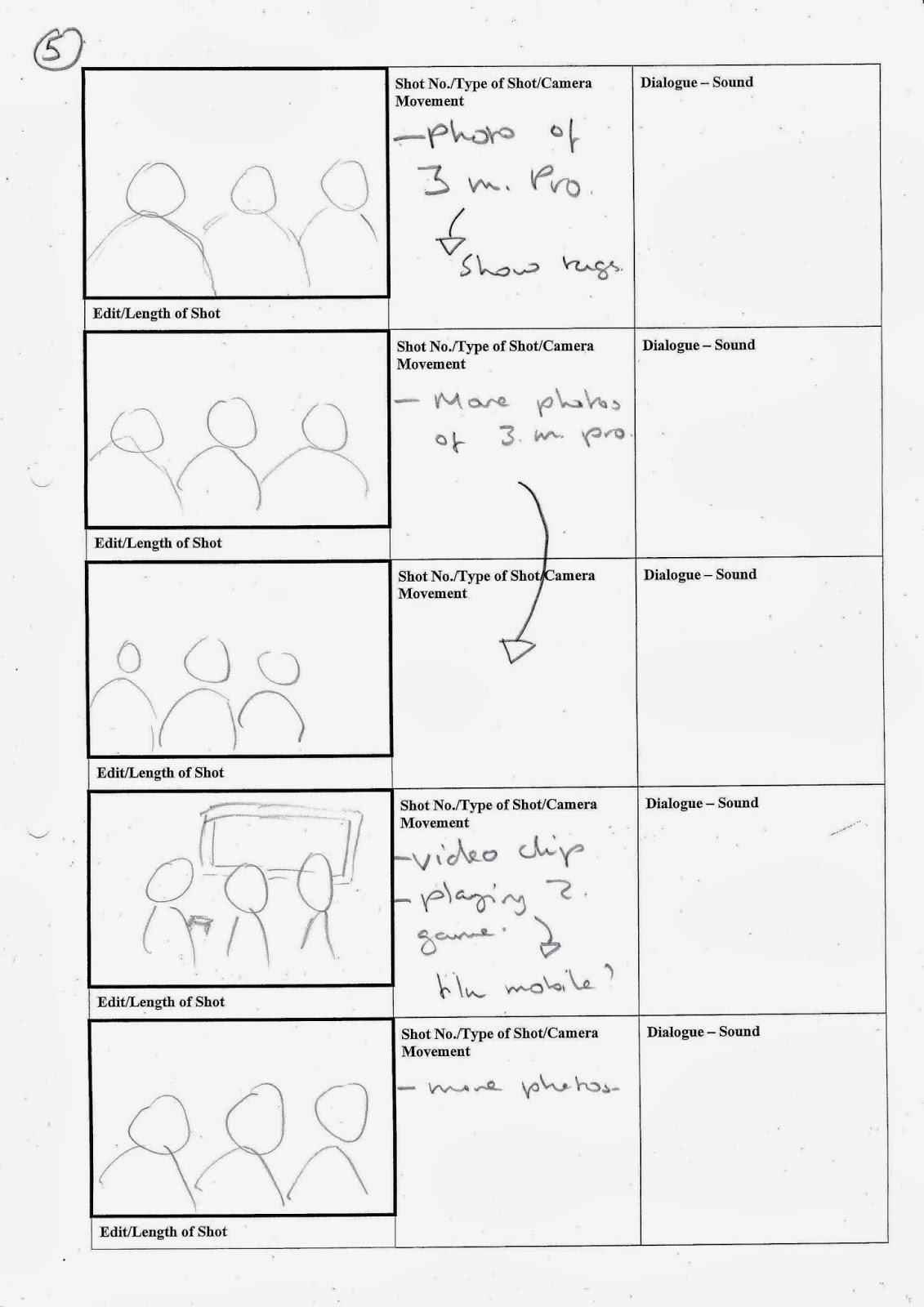
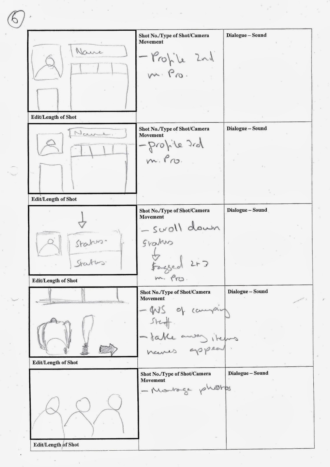
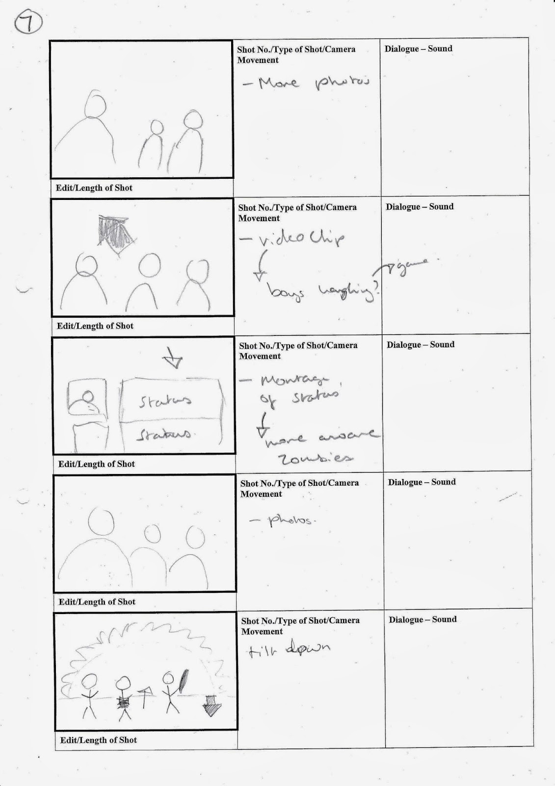
This is the second draft of our storyboards for our title sequence that we completed in Emily's class. We also spoke of preproduction plans and creating a schedule for which thing should be completed by and what we should be doing during the holidays filming wise.
Group Research
During one of our groups breaks and free lessons, we started to begin thinking about what sounds we would use within our title seqeunce.
These are some uncopyrighted tracks we are considering to use for the soundtrack. We are thinking about layering some of the tracks over each other, or even recording noises and making a song from that (showing the humour element in our film).
This is the sort of make up we want our zombie's to look like, maybe not as much detail like the boils and the veins, but definitely the dark eyes and emphasis on the chest.
We are thinking about use zombie screeches/cries during our title sequence. This is what we want our zombies to sound like, however we will record our own zombie noises.
These are some uncopyrighted tracks we are considering to use for the soundtrack. We are thinking about layering some of the tracks over each other, or even recording noises and making a song from that (showing the humour element in our film).
This is the sort of make up we want our zombie's to look like, maybe not as much detail like the boils and the veins, but definitely the dark eyes and emphasis on the chest.
We are thinking about use zombie screeches/cries during our title sequence. This is what we want our zombies to sound like, however we will record our own zombie noises.
Initial Storyboards
First Draft Story Boards:
We started creating our story boards. This is the first draft.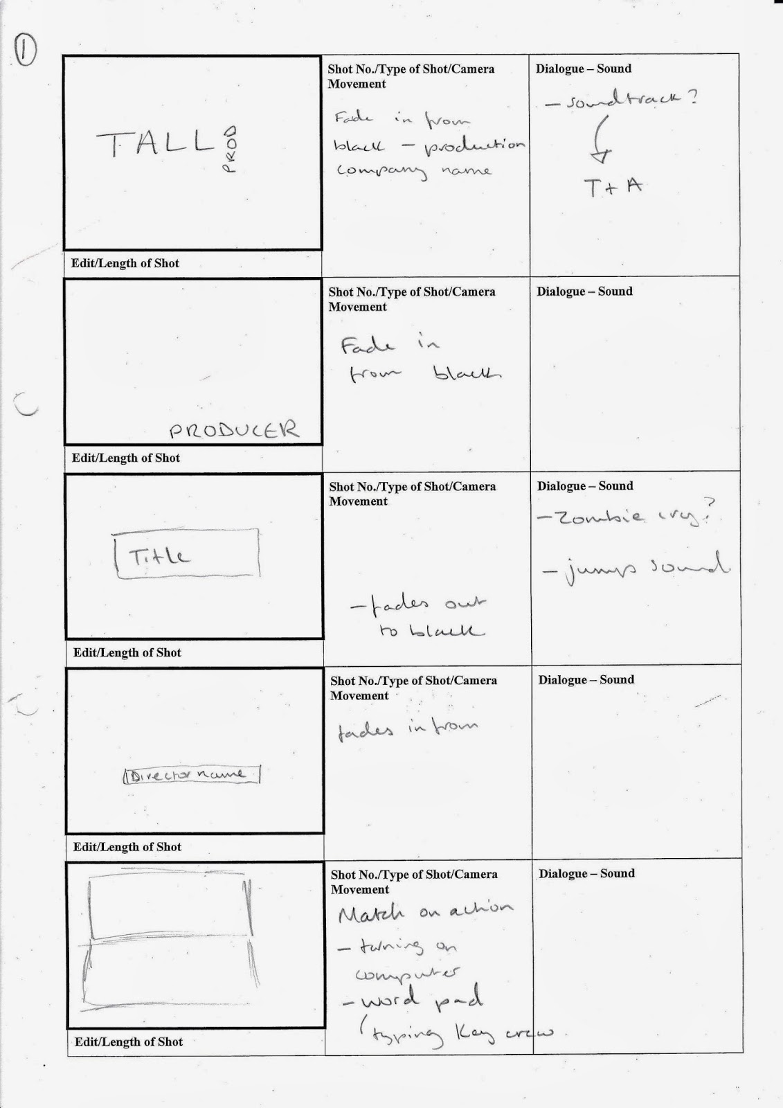
Subscribe to:
Posts (Atom)